

Most Common UI/UX Design Mistakes That Kill Website Conversions
5 min
Web Design (UI/UX)
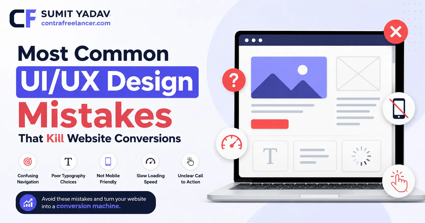
You spend money on ads, you write good copy, traffic shows up on your website... and then nothing happens. No form fills, no calls, no sales. If that sounds familiar, the problem is rarely your offer it's usually one of the Most Common UI/UX Design Mistakes quietly pushing visitors away before they ever get the chance to say yes. I'm the freelancer behind Contra Freelancer, and I've spent years fixing exactly this kind of "invisible" problem for real businesses. In this article, I'll walk you through what's actually going wrong, why it's costing you money, and how to fix it.
What Are UI/UX Design Mistakes and Why Should You Care?
UI is what your website looks like. UX is what it feels like to use. When either one breaks down, people don't email you to complain they just quietly close the tab. Google's own behavioral research has shown, again and again, that first impressions form in a matter of seconds, and mobile users abandon slow pages almost as fast as they open them. That's the real, uncomfortable truth behind most UI UX Mistakes: visitors rarely tell you what went wrong. They just leave.
And "conversion" doesn't only mean a sale. It's a form filled out, a call booked, a demo requested, a newsletter sign-up. Every one of these depends entirely on how effortless it feels to move through your site. A confusing layout or a hidden button is enough to lose someone who was already convinced by your product.
Here's the part most business owners miss: this ties directly into Google's E-E-A-T framework Experience, Expertise, Authoritativeness, and Trustworthiness. A site that feels clunky, slow, or unpolished sends the same warning signal to a human visitor and to a search engine crawler. Great content sitting on top of a broken experience still underperforms. Design and trust are no longer separate conversations.
Most Common UI/UX Design Mistakes That Silently Hurt Your Website
Let's get specific. Here are the Most Common UX Design Mistakes I see over and over, across almost every industry and exactly how to fix each one.
1. Cluttered and Confusing Navigation
When someone lands on your site and can't figure out where to click within a few seconds, you've already lost momentum. Overstuffed menus, vague labels like "Solutions" or "Resources," and too many nested dropdowns force visitors to think harder than they should have to. Confused visitors don't explore they exit.
Fix: Keep your main menu to 5–7 clear items, name things the way your customers actually think about them, and always give visitors an obvious way back to the homepage.
2. Ignoring Mobile Responsiveness
More than half of all web traffic today comes from phones, and Google evaluates your mobile site first when deciding how to rank you. Yet so many websites still show tiny text, overlapping buttons, or layouts that need pinch-zooming just to read a headline. It's frustrating, and frustrated visitors don't convert.
If you're a startup founder searching for a Custom Responsive Website Developer Freelancer USA, this is almost always the first thing worth fixing before spending another rupee on ads driving traffic to a broken mobile experience.
Fix: Design mobile-first, test on real devices (not just browser previews), and make every tap target big enough for a thumb, not a mouse cursor.
3. Slow Page Load Speed
Speed is one of the most measurable, most brutal UI UX Mistakes out there. Google's Core Web Vitals directly weigh loading performance in rankings, and industry research has shown that a huge share of mobile users simply give up on a page that takes more than a few seconds to load. Every extra second is a door closing on a potential customer.
Fix: Compress and lazy-load images, trim unnecessary third-party scripts, and choose hosting that doesn't buckle under real traffic.
4. Poor Color Contrast and Readability
Low-contrast text on a "clean" pastel background might look nice in a design mockup, but in the real world, people squint, struggle, and leave. Tiny fonts and decorative typography choices consistently hurt readability, especially for older audiences or anyone browsing on a bright afternoon outdoors.
Fix: Stick to WCAG-recommended contrast ratios, keep body text at 16px or larger, and avoid light-gray-on-white combinations no matter how "modern" they look.
5. Weak or Missing Call-to-Action (CTA)
A CTA button that blends into the page, says something vague like "Click Here," or sits buried below three scrolls of content is one of the Most Common UI/UX Design Mistakes directly responsible for lost conversions. Visitors shouldn't have to hunt for their next step it should be obvious.
Fix: Use action-driven copy ("Get Your Free Quote," "Book a Call Today"), give it strong visual contrast, and place your primary CTA above the fold.
6. Inconsistent Design Elements
Mismatched fonts across pages, buttons that look different on every screen, spacing that feels random this kind of inconsistency quietly erodes trust. Visitors may not consciously notice it, but they feel that something's "off," and that feeling bleeds into how much they trust your business.
Fix: Build a simple, repeatable design system one set of colors, one font pairing, one button style and apply it everywhere, without exceptions.
7. Too Many Steps in Checkout or Forms
Long forms and multi-step checkouts are one of the single biggest reasons people abandon a purchase mid-way. Usability research has consistently found unnecessary friction in checkout flows to be among the top causes of cart abandonment for online stores.
If you run an ecommerce store, this is exactly where a Freelance Ecommerce Website Developer USA can make a real, measurable difference in recovered revenue sometimes just by removing three unnecessary form fields.
Fix: Ask only for what you truly need, offer guest checkout, and show a visible progress bar for multi-step processes.
8. Ignoring Accessibility Standards
Designing only for the "average" visitor quietly locks out people with visual, motor, or cognitive differences and this is as much a business risk as it is an ethical one. Accessibility isn't a nice-to-have anymore; it's part of what a genuinely well-built website looks like today.
Fix: Add meaningful alt text to images, make sure every element works with keyboard navigation, and use proper semantic HTML so screen readers can interpret the page correctly.
9. Intrusive Pop-ups and Ads
A pop-up that fires the second someone lands on your page, or one that's nearly impossible to close on mobile, prioritizes your marketing goals over the visitor's patience and it shows. Google has specifically penalized intrusive interstitials that block content on mobile search results.
Fix: Trigger pop-ups based on real intent scroll depth or exit intent and always make the close button large and obvious.
10. Lack of Trust Signals
No testimonials, no visible contact details, no real proof of past work, an "About" page that says nothing real these gaps make visitors hesitate right when they're closest to converting. This is one of the Most Common UX Design Mistakes that businesses consistently underestimate.
Something as simple as a genuine "View my Projects" section on a freelancer's site does more heavy lifting for conversions than most people expect real, visible proof always beats a polished promise.
Fix: Add honest testimonials, real project screenshots, transparent process details, and easy-to-find contact information.
UI/UX Mistakes vs Best Practices: Quick Comparison Table
UI/UX Design Mistake | Impact on Conversions | Recommended Best Practice |
|---|---|---|
Cluttered navigation | Visitors get lost and leave early | Simple, predictable menu structure |
Non-responsive design | High mobile bounce rate | Fully responsive, mobile-first layout |
Slow page load speed | Users abandon before page loads | Optimize images, use lazy loading |
Poor color contrast | Reduced readability, accessibility issues | Follow WCAG contrast standards |
Weak CTA placement | Visitors don't know the next step | Bold, action-driven CTA above the fold |
Inconsistent design elements | Site feels unreliable | Maintain a consistent design system |
Long, complex forms | High cart/lead abandonment | Short forms, guest checkout options |
Ignoring accessibility | Excludes real users, legal risk | Alt text, keyboard nav, semantic HTML |
Intrusive pop-ups | Frustrates and drives users away | Delayed, easy-to-close pop-ups |
No trust signals | Visitors hesitate to convert | Testimonials, real project proof |
How These Mistakes Quietly Affect Your Google Rankings Too
Google's algorithms have moved well past simple keyword-matching. They increasingly reward sites that genuinely work well for real people, not just ones that are technically "optimized." Core Web Vitals measure real loading speed, real interactivity, and real visual stability all pure UX metrics at their core. A site full of UI UX Mistakes tends to show high bounce rates and short session times, and those behavioral patterns can shape how search engines perceive the overall quality of your site.
E-E-A-T fits into this picture in a way people often overlook. Experience and Trustworthiness aren't only about your written content they're about the entire journey a visitor takes on your site. Beautifully written copy sitting inside a confusing, slow, or untrustworthy-feeling layout still loses. Fixing the Most Common UI/UX Design Mistakes on your site isn't just a design task anymore it's an SEO task and a revenue task, all rolled into one.
How to Fix UI UX Mistakes Without a Full Redesign
The good news: you rarely need to tear everything down and start over. Sharper CTAs, faster load times, cleaner navigation, and mobile fixes can noticeably lift conversions within weeks, not months. The real starting point is an honest audit ideally backed by heatmaps or session recordings so you're fixing actual friction points instead of guessing.
If you're a startup working with a tight budget, you genuinely don't need a big agency retainer to get this right. If you're trying to Find Low Budget Web Developer for Startups in USA, working directly with an independent freelancer usually means more focused attention, faster turnarounds, and no layers of account managers between you and the person actually doing the work.
Why Working Directly With the Right Person Matters
Templates and drag-and-drop builders can get a website live, but they rarely fix the deeper UX problems that quietly cost businesses real conversions. That's where working with someone who understands both design and user behavior makes the actual difference. I built Contra Freelancer as my own independent freelance practice not a marketplace, not a platform with a pool of freelancers, but a direct, personal working relationship where I handle your project myself, start to finish.
If you're ready to Hire Website Development Services Freelancer Today, you're talking to and working with the person who's actually going to build your site not a rotating team or a project manager relaying your feedback. That kind of direct communication tends to produce faster, more accurate results. For online stores specifically, I've also worked closely with founders who wanted to Find Experienced Freelancer For Ecommerce Websites in USA, focusing on the two areas that hurt revenue the most: checkout friction and product page clarity.
Conclusion
UI/UX mistakes rarely show up with a warning sign. They creep in quietly a slightly higher bounce rate here, a slightly lower conversion rate there, a visitor who almost bought but didn't. Once you understand the Most Common UI/UX Design Mistakes slow load times, weak CTAs, missing trust signals, and the rest you have a genuinely useful checklist to run against your own site today.
Small, deliberate fixes add up faster than most people expect. You don't need to redesign everything overnight; you need to find what's actually costing you conversions and fix that first, with intent. And if you'd rather hand that off to someone who does this for a living, that's exactly the kind of work I take on personally through Contra Freelancer. If you're looking for dependable Freelancer Services for Website Development USA, feel free to reach out let's figure out together what's quietly holding your website back from converting the way it should.
FAQs
Q1. What is the most common UI/UX design mistake on websites?
A1. Weak or poorly placed call-to-action buttons are among the most common and most damaging mistakes for conversions.
Q2. How does slow page speed affect conversions?
A2. Slow-loading pages cause visitors to leave before the content even appears, directly reducing conversions and increasing bounce rate.
Q3. Does UI/UX design actually affect SEO rankings?
A3. Yes, Google's Core Web Vitals and user behavior signals are closely tied to UX quality, indirectly influencing rankings.
Q4. How often should a website's UI/UX be audited?
A4. A basic UX audit every 6 months helps catch friction points before they meaningfully hurt conversions.
Q5. Can fixing UX mistakes really increase sales?
A5. Yes, even small fixes like clearer CTAs or shorter checkout forms often produce a measurable increase in conversions.
Q6. Is mobile responsiveness really that important for conversions?
A6. Yes, with the majority of traffic coming from mobile devices, a non-responsive site directly turns away potential customers.
Q7. Do I need a full redesign to fix UI/UX mistakes?
A7. No, most UX problems can be fixed with targeted improvements without a complete website redesign.